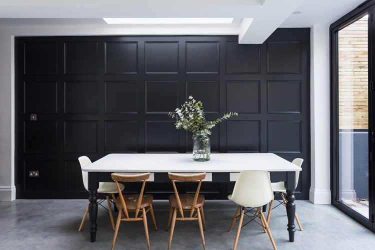
anders house via shootfactory
A mix of old favourites and new finds this week as we head into the summer holidays when The Mad House will be taking its annual August break. It’s a chance for me to recharge my batteries and take a break from posting five days a week and a chance for you to catch up on posts you may have missed both old favourites and new discoveries.
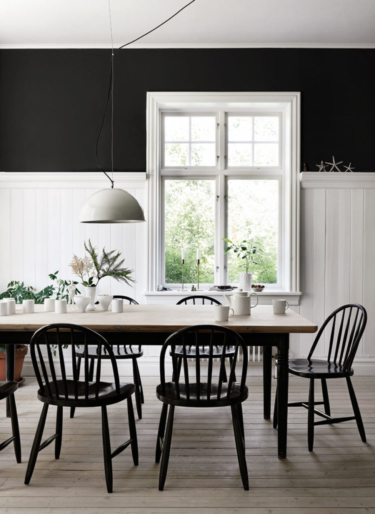
image by petra bindel for elle decoration sweden
I do love a black and white kitchen. Well mine is, as you know, and while this combination can appear stark and ultra modern, it is also easy to soften with the addition of a wooden table, natural floorboards and the odd vintage rug. So this timeless look can be, as they say in fashion, dressed up or down depending on your tastes.
See how the wooden table works to make this look a little more rustic in the picture below? That floor is very shiny and modern, as is the rest of the kitchen, but the dining area is softer and more inviting and contrasts well with the hard edges around it. If you ever panic that you’ve designed something too hard then bring some wood in – preferably old.
image by Sharyn Cairns
When we first decorated our kitchen with the stainless steel worktops we worried that we had created something too lab-like and surgical for the look we wanted, but the reclaimed floorboards, which were so perfectly imperfect, worked to counterbalance the modernity of the surfaces.
This is another reason why I often suggest using some patterned cement tiles in a kitchen or bathroom. It has the same effect. Otherwise all those hard slabs of tiles and edges and doors can be a little intimidating for a room which is, after all, the beating heart of the home.
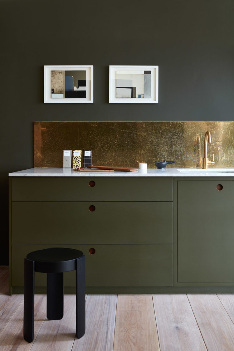
naked kitchens – the ladbrooke
Mind you then I saw this and suddenly I’m all over the idea of an olive green kitchen. I’m not sure a brass splashback is affordable in the real world so let’s just gaze at it and dream for a while shall we? It’s by Naked Kitchens and will occupy my thoughts for some time I foretell.
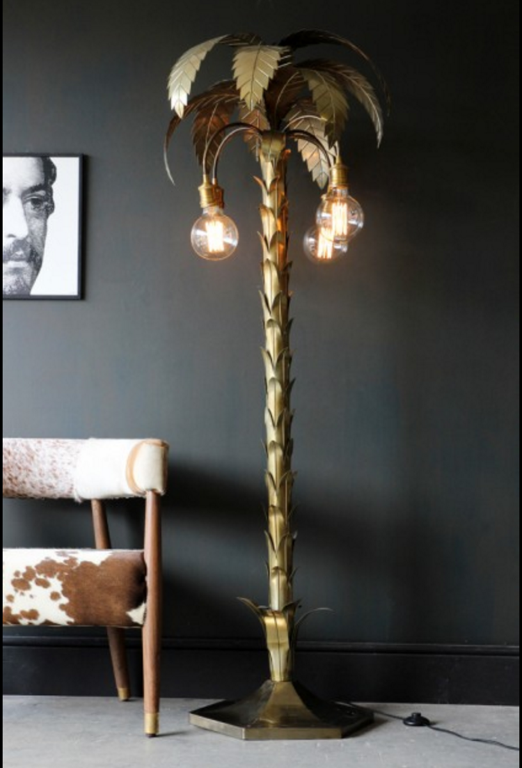
palm tree floor light by rockett st george
Talking of dreams. This palm tree light. I first saw it on the Rockett St George website a few weeks back and featured it in the 10 Best Floor Lamps. Then I saw it in the flesh at their press show last week. Reader, I fell in love. I simply have to have this light. It will look like this against my dark grey walls. It will sing next to my charcoal velvet sofa. It will bring meaning to my sitting room. And when I no longer want it in there, it will stand in the corner of my bedroom and I shall awake to the sight of a golden palm tree every morning. And quite frankly, who on earth doesn’t want to do that? Give me three ways in which your life would not be improved if that was the first thing you saw when you opened your eyes?
It’s currently out of stock which gives me saving and justifying time. Check back in September. It WILL be mine mwahahahahaha….
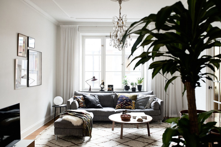
via wrede.se
Every room should have one stand-out piece. Ideally everything you own should be amazing and something that you love, but they don’t all have to be showing off or shouting for attention. It’s the Marie Kondo decluttering school of thought isn’t it? If it doesn’t spark joy then chuck it out. To which scores of people started grumbling that their potato peeler didn’t give them joy but was simply a necessity. To which I would say, if it doesn’t do the job well enough to make a boring task more bearable then you’ve bought the wrong one (try a Y-shaped Good Grips). If it can’t be beautiful at least make it the most efficient of its type.
And I say that as an a avid clutterer. I am practically a REclutterer. I have no truck with that minimal living business. I wish to be surrounded by fabulous things at all times. Things that bring memories, that look beautiful, that I want to use and to keep. That’s what sparks my joy Marie mate but each to their own and all that.
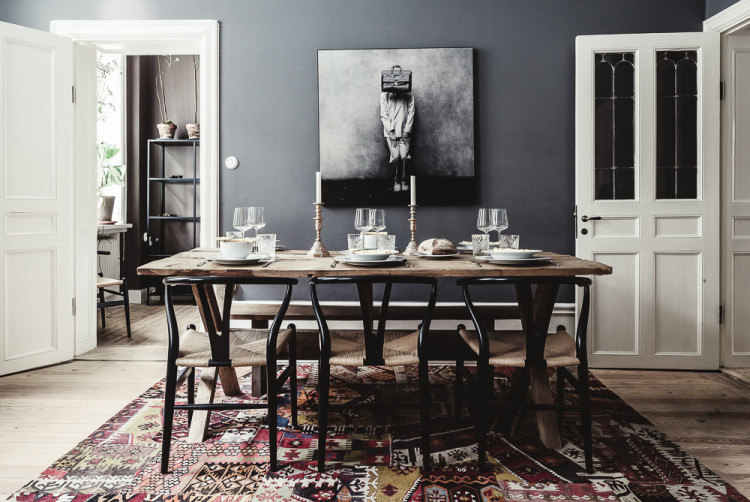
via 1ststreet.se
Right moving on from my digression, look at this: dark grey and white colour scheme, vibrant rug, old wood, vintage candlesticks and a little drop of black on the legs of the chairs. That’s how to put a room together right there. There’s potentially only one thing missing – something metallic – we’ll assume it’s the candlesticks. Or that there’s a mirror out of shot to help bounce the light around and make it feel more luxe. Job done. I can retire. Or at least go on holiday.
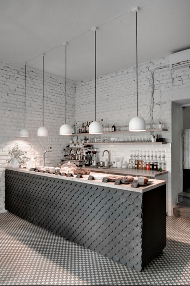
via twenty7 bistro
I could go here. This is a cafe in Prague. I love the how the island has been clad in those scallop-shaded tiles. In a domestic kitchen it would probably be a cleaning nightmare. Since this is a cafe, I suspect the cooking happens elsewhere and, as much as I hate being practical, even I can concede that there are times when needs must.
Look at the floor instead. Those tiles look great – so much better than a plain floor would. And, while we’re on that. If you are tiling your kitchen floor with pattern then remove the wooden skirting boards and do them in tiles instead. That’s a touch as one of my husband’s colleagues would say.
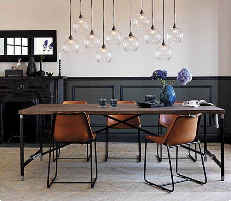
viacb2.com
Leather chairs – always good in a kitchen. Leather just gets better with age and it really doesn’t mind the odd marmitey finger or greasy mark. Basically, you can bring your own tribe of mini Jammy Dodgers in and the leather won’t mind. It’s so much more practical than you might think. But, please, not those modern chairs with the really high backs that are either covered in leather or linen. Not those. You know the ones I mean. Please don’t any of you get those. I’m not linking to them because you’re not to have them but you can google leather dining chairs… you’ll see.
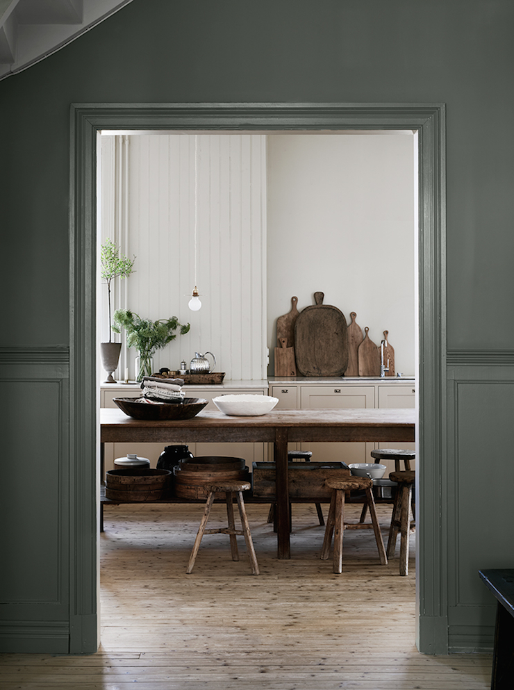
modern meets rustic in this Swedish home, image by Kristoffer Johnsson
And we’ll end with this. Just because it’s lovely. And because this time next year you’ll all be asking me for the right shade of green…. I’m going to take a punt that it’s Pigeon by Farrow & Ball. Because it’s basically grey with green in. At least it is this year. Next year I shall be telling you that it’s green with a dollop of grey so it will go with all the grey stuff you already have.
The post 10 Beautiful Rooms appeared first on Mad About The House.
from Mad About The House http://www.madaboutthehouse.com/10-beautiful-rooms-17/
No comments:
Post a Comment