I’m going to show you more of this house later in the week so this is by way of a teaser and a reminder to come back on Friday because not only is it full of beautiful rooms, but it’s for sale as well. Winning! Well winning if you’re super rich, but it has lots of design ideas to nick be inspired by. So, in essence, winning for everyone. And you can’t have a better start to the week than that.
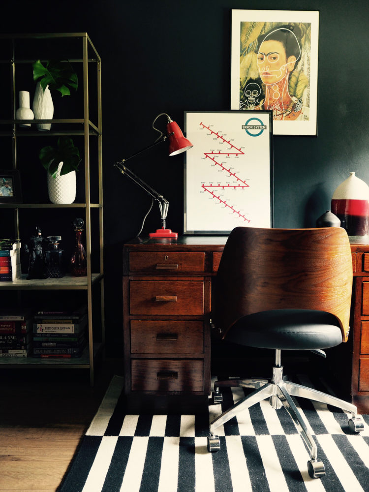
dark office by seasonsincolour taken by Jenny Kakoudakis
What do you think of this fabulous home office? It was on the blog Seasons in Colour (which I love – go and read it) and is the office of her husband. I just love the dark walls and splashes of red, don’t you?
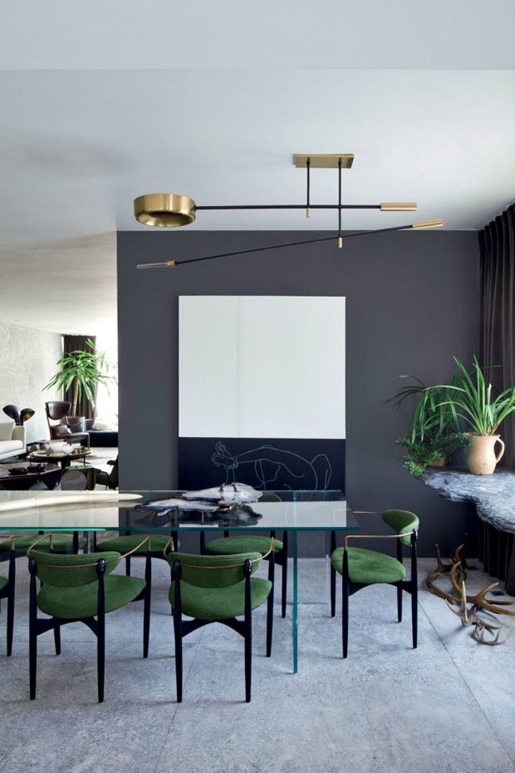
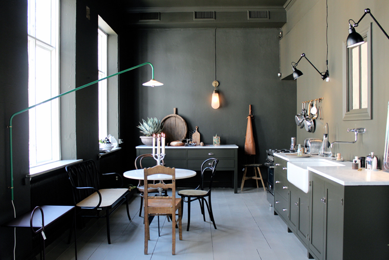
the Brazilian home of Osvaldo Tenorio image via Vogue
Sticking with dark walls, have a look at the home of designer Osvaldo Tenorio. Isn’t that dark grey just heavenly with some soft green and a brass light fitting. And for those of you to whom I have suggested painting the ceiling, take a look below. It is the fifth wall after all and this kitchen looks great doesn’t it?
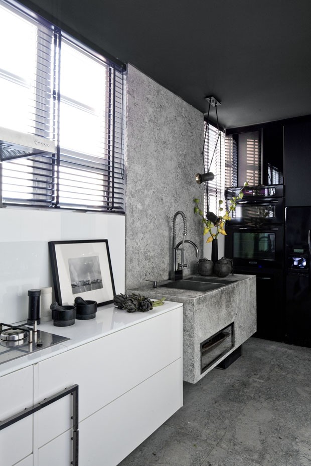
casa vogue global osvaldo tenorio kitchen
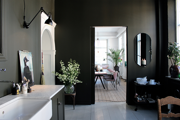
Another dark kitchen, this time from the Artilleriet Studio, in Sweden. This is for all those that don’t want a grid of downlighters on their kitchen ceiling but wish for something more intimate and individual. In all honesty, I might have both as nothing beats a good strong task light, but these angled lights look wonderful and really elevate the space.
artilleriet studio
The same room from the other end. Note how painting one room dark and then leaving it open to a lighter one makes both look better. The eye is drawn to the lighter room which, in turn, appears even brighter. The effect is almost like a painting.
One of my clients this week asked me if he should paint his long dark hall dark, contrary to popular advice. I said yes for exactly this reason. He will have a white kitchen at the end of it and a pale grey sitting room to the side. We are going to look for some patterned monochrome tiles for the floor as a practical choice and one that will bring all three rooms together.
artilleriet store
Leaving the dark side (momentarily) to look at a pale kitchen, this image is from another great blog The Design Chaser, pop over there too while you’re in the zone. Not everyone wants dark walls but painting the units in a dark grey just looks good against the pale walls. That light would be easy to copy too. These days you really don’t need an electrician to move sockets if they’re in the wrong place. You just need him to fit extra flex and then you have the freedom to move them wherever you like.
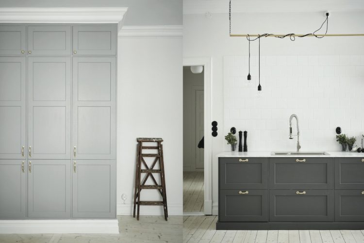
shades of grey kitchen via thedesignchaser
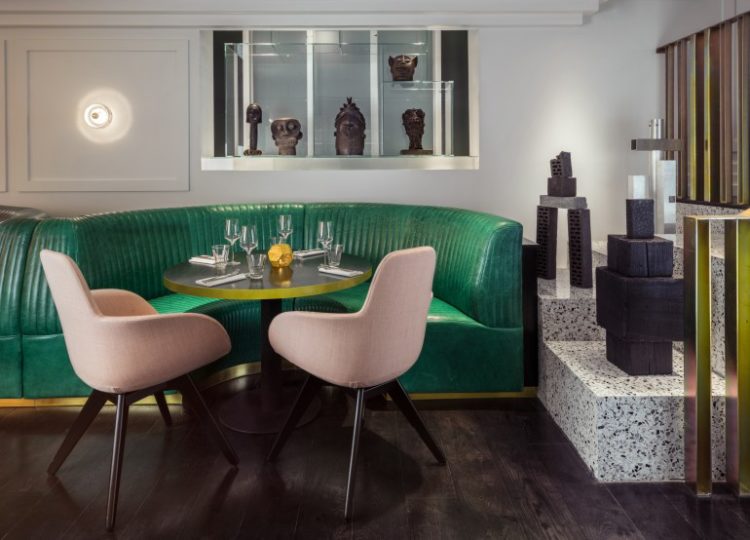
Now I know I said we were leaving the dark rooms but I simply couldn’t resist this gorgeous green on the walls of Le Roch Hotel & Spa in Paris. Look how it contrasts with the wood and that small area of patterned tile breaks up the space and acts like a carpet but is more practical to keep clean.
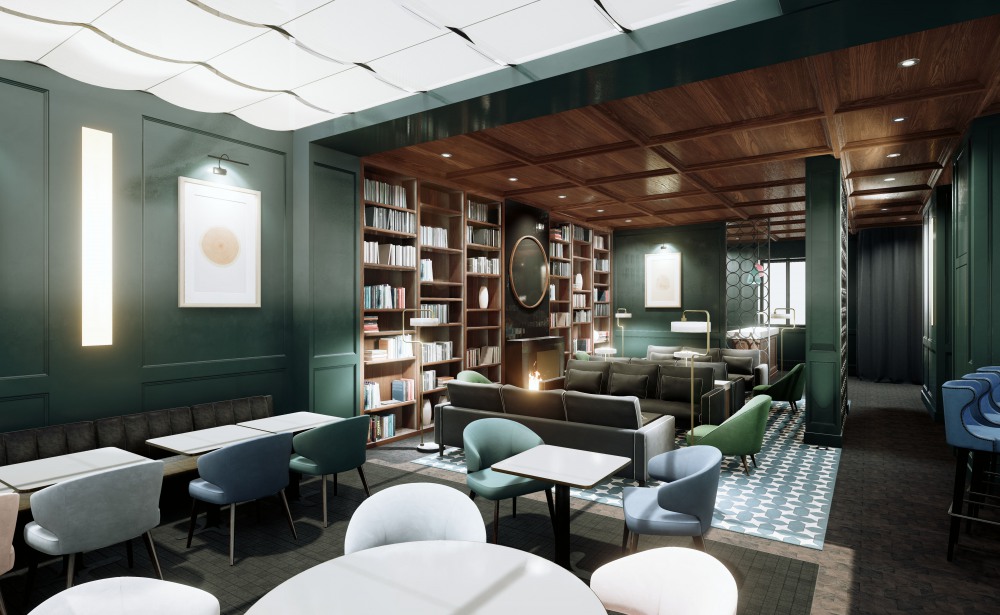
hotel le roch and spa
This is one of the bedrooms from the same hotel and it’s the age old dilemma, and one which I haven’t resolved myself yet; do you want your bedroom to be dark and cosy so you can sleep, or light and bright so you can get up in the morning? I suspect the white ceiling and double window go a long way towards making this bedroom work in both directions so it’s probably a judgement call in your own house.
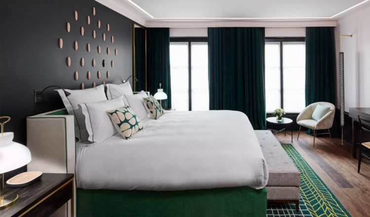
le roch hotel and spa in Paris
Finally, more green. I’m sure a colour psychologist would have a field day explaining my current attraction to this colour. There is none of it in my house and only a few pieces in my wardrobe (of the olive variety – none like any of these) but this emerald green bench with the blush chairs as put together by Tom Dixon for the Bronte are just gorgeous aren’t they?
bronte by tom dixon
I have just put together a scheme for an office refurbishment which has emerald green mixed with lots of black and white. The other accent colour is a small amount of gold/yellow. Blush pink would have been lovely but didn’t fit.
Next time….
The post 10 Beautiful Rooms appeared first on Mad About The House.
from Mad About The House http://www.madaboutthehouse.com/10-beautiful-rooms-15/
No comments:
Post a Comment