A mixed bunch of beautiful rooms for you this week. We start off with this restaurant in Portland, Oregon, which has this fabulous wallpaper. Would it surprise you to learn the restaurant is called Moule? Or Mussel? I suspect it was designed especially for this room but if anyone has seen it available to buy then let me know because it might be the perfect thing for my wardrobe (more on that later in the week by the way).
antique mirror in the home of Ochre founder Harriet Maxwell Macdonald image by Ditte Isager
Now remember I was talking about creating your own antique mirror last week? Well here is it in the home of Harriet Maxwell Macdonald, founder of Ochre (one of my favourite interiors stores – or it will be just as soon as I have married someone slightly richer than my husband).
I adore the the colour scheme in this room; black, pale pink chair, old mirror and fabulous lighting. And this is their kitchen pictured below. More black, more great lighting and open shelving.
the kitchen of Andrew Corrie and Harriet Maxwell Macdonald image by Ditte Isager
Sticking with a fairly monochrome interior design scheme, this room in Barcelona is available for hire for shoots. I love how the black window frames really define the space and if it were possible to paint windows without taking them out of their sockets then I would be doing it right now. Well, maybe paying someone to do it right now..
black windows and vintage furniture in this Barcelona loft via Shoot115 which is available to hire for photography
It’s a similar story here. The leather armchair and black and white rug are perfect in this room, even if we don’t all have a ceiling like this.
via wrede.se
As regular readers will know, I have open shelves rather than cupboards but these look great don’t they? I know that many people prefer cupboards as they don’t want their stuff on display and fear the dust. This way you can create a wall of storage where everything is hidden. May I make one suggestion though? If you have cupboards, consider taking them all the way up to the ceiling. When you stop them about a foot below the ceiling all that happens is that you still stuff things up there, you still can’t reach them and, because they are, by their very nature, the things that you don’t use very often, they end up covered in dust.
Take the cupboards to the top. It will make the ceiling look higher and you won’t have to look at the clutter of things that you don’t use very often.
grey kitchen with wooden table image by Jesper Florbrants
And then just when I think I’m all about dark I see this and I remember why I love pale grey as well. And then I start thinking about painting everything white again…
pale grey kitchen with white aga by Paul Massey who designed and photographed this room
I would be the first to say that a retro chandelier can be a bit of cliche but you know what. Instead of putting it in your hall or sitting room, stick it in the kitchen where it will bring an unexpected element to the decor. This is one my Top 10 Interior Design Tips It works really well in this kitchen perhaps because of the contrast between the utilitarian tiles and the glamour of the crystal chandelier.
white kitchen with vintage chandeliera via frantasticfrank.se
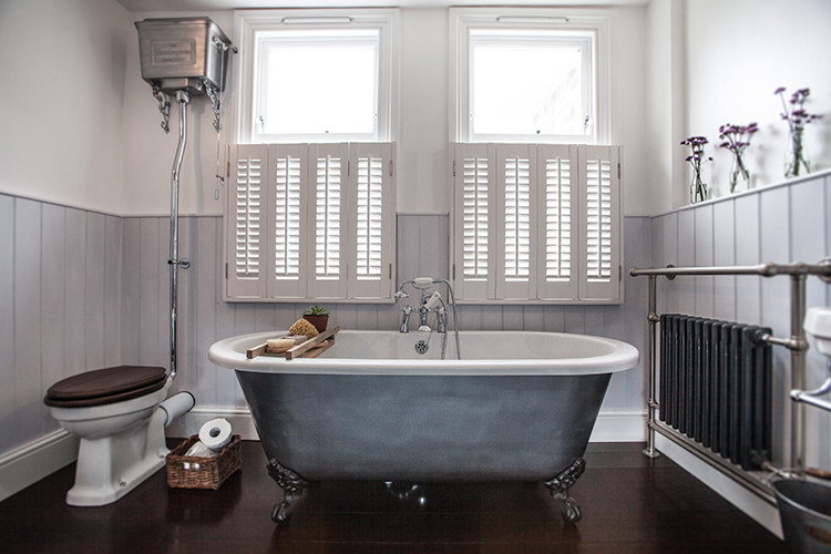
Moving into the bathroom now, just look at this. Wainscotting, a freestanding tub painted silver and some vintage fittings. As much as I love patterned tiles, I really love this effect.
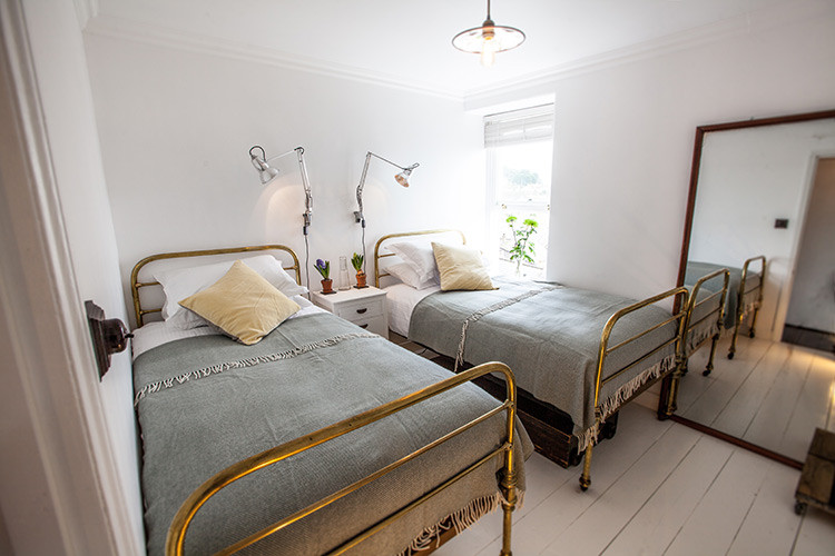
In the same house, which is for rent by the way, is this bedroom, with these rather lovely brass beds. Don’t they look great with the grey bedding. The decor is really very simple and just relies on two unusual beds for impact. There’s nothing difficult or unusual about the rest – white painted floorboards, a large mirror and a couple of wall-mounted lights. Easy.
When you know how. Still, I hope this blog is helping you find out how and that it is also inspiring you with your own interior design schemes.
The post 10 Beautiful Rooms appeared first on Mad About The House.
from Mad About The House http://www.madaboutthehouse.com/10-beautiful-rooms-57/


No comments:
Post a Comment